网页深色模式全攻略:从设计规范到代码实现,一篇讲透
- 2026-06-25 20:24:52
在低光环境下使用深色界面可减少约 30-40% 的视觉疲劳,同时提升OLED屏幕设备的续航时间。本文将带你全面掌握现代网页深色模式的实现精髓。
一、为什么深色模式如此重要?
深色模式早已不再是简单的“时尚潮流”,而是现代用户体验的重要组成部分。随着苹果、谷歌、微软等主流操作系统全面支持深色主题,用户对网站和应用的主题一致性提出了更高要求。
数据显示:
超过 82% 的用户在低光环境下更喜欢使用深色模式。
OLED屏幕上,深色模式可节省 30-60% 的电池消耗。
适当地应用深色主题能减少 视觉疲劳,尤其在夜间使用场景。
二、核心实现方案详解
2.1 CSS类切换法:最经典的实现
这是最直观的实现方式,通过JavaScript动态修改文档根元素类名实现主题切换。
<bodyclass="light-theme"><buttonclass="theme-toggle"aria-label="切换主题">🌓</button></body>
class ThemeManager {constructor() {this.currentTheme = localStorage.getItem('theme') || 'light';this.init();}toggle() {this.currentTheme = this.currentTheme === 'light' ? 'dark' : 'light';document.body.classList.replace(`${this.currentTheme === 'light' ? 'dark' : 'light'}-theme`,`${this.currentTheme}-theme`);localStorage.setItem('theme', this.currentTheme);}}
优势:简单直接,兼容性好。
适用场景:中小型项目,需要广泛浏览器支持。
2.2 CSS自定义属性方案:现代最佳实践
利用CSS变量实现主题切换,是目前最推荐的方法。
/* 定义主题变量 */:root {/* 浅色主题 */--bg-primary: #ffffff;--text-primary: #1a1a1a;--accent-color: #007bff;}
[data-theme="dark"] {/* 深色主题 */--bg-primary: #0d1117;--text-primary: #f0f6fc;--accent-color: #3399ff;}
/* 使用变量 */body {background-color: var(--bg-primary);color: var(--text-primary);transition: background-color 0.3s ease, color 0.3s ease;}
性能优势:浏览器只需重新计算样式,无需重新渲染DOM。
维护性:所有颜色定义集中管理,易于维护。
2.3 动态样式表切换:大型项目方案
对于组件化、模块化的大型项目,按需加载主题样式表可能更合适。
// 样式表动态加载async function loadTheme(themeName) {// 移除旧主题样式const oldLink = document.getElementById('theme-stylesheet');if (oldLink) oldLink.remove();// 创建新链接const link = document.createElement('link');link.id = 'theme-stylesheet';link.rel = 'stylesheet';link.href = `/themes/${themeName}.css`;document.head.appendChild(link);return new Promise(resolve => {link.onload = resolve;});}
三、系统级集成策略
3.1 自动检测用户系统偏好
现代CSS提供了 prefers-color-scheme 媒体查询,可以直接检测用户系统主题设置。
/* 系统偏好检测 */@media (prefers-color-scheme: dark) {:root {--bg-primary: #121212;--text-primary: #ffffff;}}
/* 高对比度模式支持 */@media (prefers-contrast: high) {:root {--border-width: 2px;--font-weight: 700;}}
3.2 JavaScript增强检测
// 综合主题检测function detectThemePreference() {// 优先级:用户保存 > 系统设置 > 默认const savedTheme = localStorage.getItem('theme-preference');const systemPrefersDark = window.matchMedia('(prefers-color-scheme: dark)').matches;return savedTheme || (systemPrefersDark ? 'dark' : 'light');}
// 监听系统主题变化window.matchMedia('(prefers-color-scheme: dark)').addEventListener('change', (e) => {if (!localStorage.getItem('theme-preference')) {applyTheme(e.matches ? 'dark' : 'light');}});
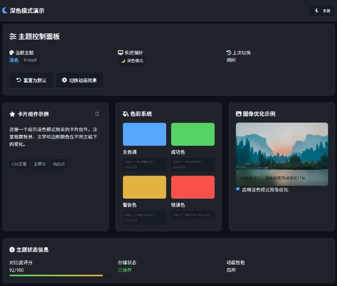
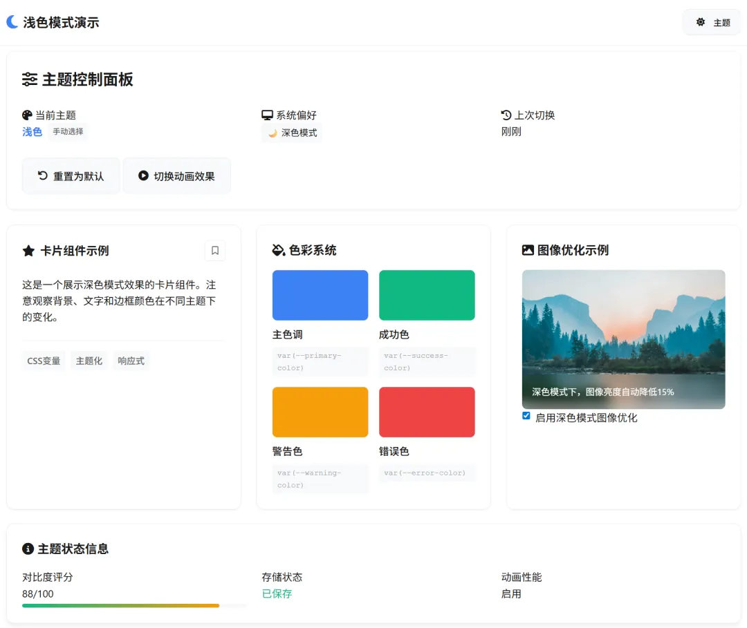
四、设计规范与视觉优化
4.1 色彩系统设计
不要简单反转颜色!深色模式需要专门设计的色彩体系。
色彩角色 | 浅色值 | 深色值 | 对比度要求 |
背景主色 | ≥ 4.5:1 | ||
文字主体 | ≥ 7:1 | ||
次要文字 | ≥ 4.5:1 | ||
品牌色 | 保持一致 | ||
错误状态 | 语义一致 |
关键原则:
深色背景 不要使用纯黑色(#000000),推荐使用深灰色。
降低色彩饱和度,避免视觉疲劳。
适当提高色彩对比度,保证可读性。
在线工具:
WebAIM对比度检查器 (https://webaim.org/resources/contrastchecker/)
Chrome颜色选择器(chrome://settings/appearance)
Dark Mode Design指南(https://darkmodedesign.xyz/)
4.2 图像与媒体优化
/* 图像深色模式优化 */img {filter: brightness(.95) contrast(1.05);}[data-theme="dark"] {/* 降低图像亮度 */img:not(.keep-brightness) {filter: brightness(.85) contrast(1.1);}/* SVG图标优化 */.icon {opacity: 0.9;}/* 减少视频眩光 */video {background: #000;}}
4.3 阴影与深度效果
在深色模式下,传统的阴影效果需要调整:
.card {/* 浅色模式:标准阴影 */box-shadow: 0 2px 8px rgba(0, 0, 0, 0.1);}
[data-theme="dark"] .card {/* 深色模式:使用更亮的阴影 */box-shadow: 0 2px 8px rgba(255, 255, 255, 0.1);/* 或者使用边框代替阴影 */border: 1px solid rgba(255, 255, 255, 0.1);}
五、无障碍访问考虑
5.1 键盘导航支持
<buttonclass="theme-toggle"aria-label="切换主题"aria-pressed="false"tabindex="0"role="switch"><spanclass="sr-only">当前主题:浅色</span></button>
5.2 对比度验证
使用工具自动检查对比度是否符合WCAG标准:
// 简单对比度检查function checkContrast(color1, color2) {// 计算相对亮度const l1 = getRelativeLuminance(color1);const l2 = getRelativeLuminance(color2);// 计算对比度const contrast = (Math.max(l1, l2) + 0.05) / (Math.min(l1, l2) + 0.05);return contrast;}// WCAG AA标准:普通文本需要4.5:1,大文本需要3:1
六、性能优化策略
6.1 防止主题切换闪烁
// 在<head>最前执行,防止FOUC(无样式内容闪烁)(function() {// 同步读取主题,避免异步导致的闪烁const theme = (() => {try {const saved = localStorage.getItem('theme');if (saved) return saved;} catch (e) {}const systemDark = window.matchMedia('(prefers-color-scheme: dark)').matches;return systemDark ? 'dark' : 'light';})();// 立即设置,不等待DOMContentLoadeddocument.documentElement.setAttribute('data-theme', theme);document.documentElement.classList.add('theme-loaded');})();
6.2 优化CSS过渡效果
/* 分层过渡策略 */:root {--transition-theme: 300ms cubic-bezier(0.4, 0, 0.2, 1);}
/* 只有颜色和背景需要过渡 */.theme-transition {transition:background-color var(--transition-theme),color var(--transition-theme),border-color var(--transition-theme),fill var(--transition-theme),stroke var(--transition-theme);}
/* 图片和布局不需要过渡 */img,video,.layout-container {transition: none !important;}
七、现代框架集成
7.1 React实现示例
import React, { createContext, useContext, useEffect, useState } from 'react';const ThemeContext = createContext();export function ThemeProvider({ children }) {const [theme, setTheme] = useState('light');useEffect(() => {// 初始化检测const saved = localStorage.getItem('theme');const systemDark = window.matchMedia('(prefers-color-scheme: dark)').matches;setTheme(saved || (systemDark ? 'dark' : 'light'));}, []);useEffect(() => {// 应用主题变化document.documentElement.setAttribute('data-theme', theme);localStorage.setItem('theme', theme);}, [theme]);const toggleTheme = () => {setTheme(prev => prev === 'light' ? 'dark' : 'light');};return (<ThemeContext.Providervalue={{theme, toggleTheme }}>{children}</ThemeContext.Provider>);}
7.2 Vue3 组合式API
<scriptsetup>import { ref, watch, onMounted } from 'vue';const theme = ref('light');const toggleTheme = () => {theme.value = theme.value === 'light' ? 'dark' : 'light';};// 监听主题变化watch(theme, (newTheme) => {document.documentElement.setAttribute('data-theme', newTheme);localStorage.setItem('theme', newTheme);});// 初始化onMounted(() => {const saved = localStorage.getItem('theme');const systemDark = window.matchMedia('(prefers-color-scheme: dark)').matches;theme.value = saved || (systemDark ? 'dark' : 'light');});</script>
八、测试与验证清单
8.1 功能测试
初始加载主题正确。
手动切换功能正常。
系统主题变化自动响应。
页面刷新后主题保持。
跨标签页同步正常。
8.2 视觉测试
所有文本对比度≥4.5:1。
图像在不同主题下清晰。
过渡动画平滑。
焦点指示器可见。
8.3 性能测试
主题切换时间<100ms。
无布局抖动(CLS=0)。
内存使用正常。
九、进阶技巧
9.1 动态主题生成
/* 基于CSS Color Level 5的混合颜色 */:root {--brand-color: #007bff;--bg-primary: #ffffff;--text-on-brand: color-contrast(var(--brand-color) vs white, black);}
[data-theme="dark"] {--bg-primary: #121212;/* 自动调整品牌色亮度 */--brand-color: color-mix(in srgb,var(--brand-color) 80%,white 20%);}
9.2 分区域主题控制
<divclass="card"data-theme="light"><!-- 强制使用浅色主题 --></div><divclass="card"data-theme="dark"><!-- 强制使用深色主题 --></div>
9.3 基于时间的自动切换
// 根据时间自动切换主题function autoThemeByTime() {const hour = new Date().getHours();const isNight = hour >= 18 || hour < 6;// 如果用户没有手动设置过主题if (!localStorage.getItem('theme-preference')) {return isNight ? 'dark' : 'light';}}
十、总结与建议
实现优秀的深色模式需要平衡多个方面:
1. 渐进增强:先从基础功能开始,确保在不支持新特性的浏览器上也能正常工作。
2. 用户控制:始终让用户有最终控制权,自动检测但不自动决定。
3. 性能优先:注意过渡效果的性能影响,避免布局抖动。
4. 无障碍访问:确保所有用户都能正常使用。
5. 一致性:保持与操作系统和其他应用的一致性。
推荐架构:
用户偏好 → 本地存储 → JavaScript处理 → CSS变量 → 实际渲染↓系统设置 → 媒体查询
深色模式不再是可有可无的“花哨功能”,而是现代网页设计的基本要求。通过合理的设计和技术实现,可以为用户提供更加舒适、个性化的浏览体验,同时也展现网站的专业性和对细节的关注。
彩蛋
本文有彩蛋,请点击 《阅读原文》,查找!!!


